
Ingredience
Wherein I look at the data

Over the years, I’ve taught a handful of courses about visual rhetoric, the way that art and design shapes our thought. I don’t consider myself especially artistic, but I have developed some solid instincts when it comes to design. And for me, visual rhetoric was a natural outgrowth of my interest in technology—I spent a lot of time, especially in the early days of the web, designing webpages, learning Photoshop so that I could create my own graphics, thinking about the impact of interface design, etc.
Interestingly enough, visual rhetoric ended up being my backdoor into data visualization. Again, I don’t have any particular claim to expertise, but I have a shelf1 that I dip in and out of on occasion. It includes some of the classics (Tufte, e.g.), a number of coffee table books, and several books that mingle productively with technology theory.
One of my favorite writers on this shelf is Jessica Hagy, whose “Indexed” was a mainstay of my daily blog reading, back back in the day. Indexed published a note card a day, and that note card used the genre of graphs and charts to deliver commentary on culture and the world. It was/is this really intriguing mix of mathematical expression on the one hand and humanities messaging on the other, a mix that resonated deeply with my own cognitive makeup.
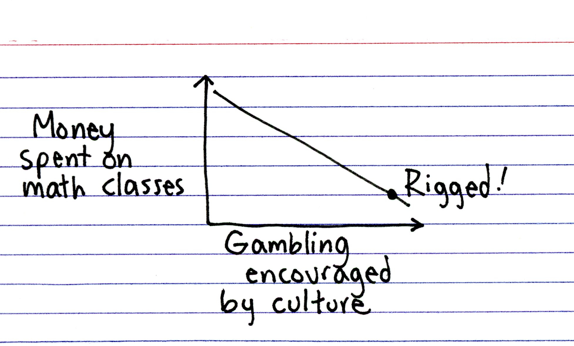
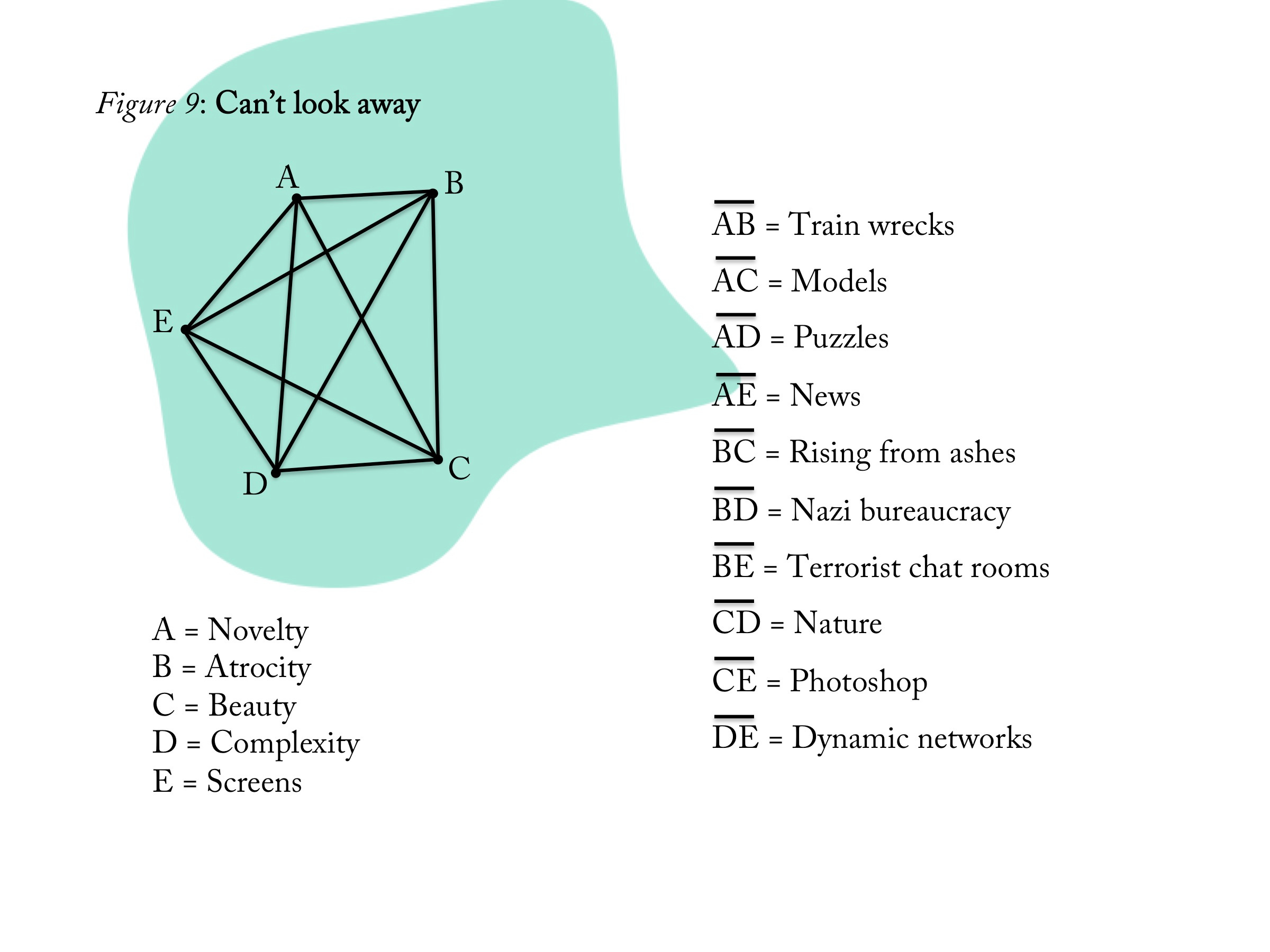
I’d also be remiss if I didn’t mention Hagy’s pentagram poems, which won a 2022 Information is Beautiful award. You can find several examples on her page, including
I share a little of her work here because I think, maybe more than anyone else, Hagy inspired me to add shelves for visual rhetoric and data visualization. Both represent different, productive ways of thinking, and if nothing else, Hagy’s Indexed demonstrates that you don’t need a 3-day Excel workshop to make use of these methods.
If Hagy’s index cards represented one end of the spectrum for me, the other end of that spectrum was Nicholas Felton’s work. At the same time that I was following Hagy, I looked forward to Felton’s annual reports, which were sets of personal data visualization designed to resemble the periodic earnings reports issued by corporations. He even built an app (Daytum) designed to facilitate the kinds of data collection that his reports visualized. Of course, this was before the surveillance turn in the tech industry, before our phones (and watches, and rings) entered their final form as data extraction platforms.
One of the things that I always struggled with, when I taught data visualization as part of my visual rhetoric courses, was where I expected students to get the information itself that they would work with. Identifying, collecting, and refining data is its own separate domain of knowledge, and I was hesitant to spend too much time on it when the course focused on visuals. So what I did was to talk to the students at the outset of the course, explain the data visualization assignment, and encourage them to do something (at a smaller scale) like Felton. (Nowadays, with all of our mobile surveillance, this would be a lot easier, I suppose.) I asked them to collect some basic data on a chosen part of their lives, and then later in the semester, they created visualizations of that data
One of the things that emerged from that project, as I asked students to reflect on it, was how the assignment itself leeched into their everyday lives by virtue of the fact that it asked them to self-observe. Conducted on a small scale2, voluntarily, these sorts of datafications can be productive self-improvements. The fact that my Kindle keeps track of my reading (and gives me little awards for consistency) actually prompts me to read everyday, for instance. When we bring our habits out of the background and focus on them consciously, it gives us the chance to intervene, to improve, etc.
That was one side-effect that my students and I noticed, anyway. The second, longer-lasting effect, for me at least, was that certain visualization genres ended up informing (infecting?) my thinking. One of my favorite genres has become the stacked bar chart.
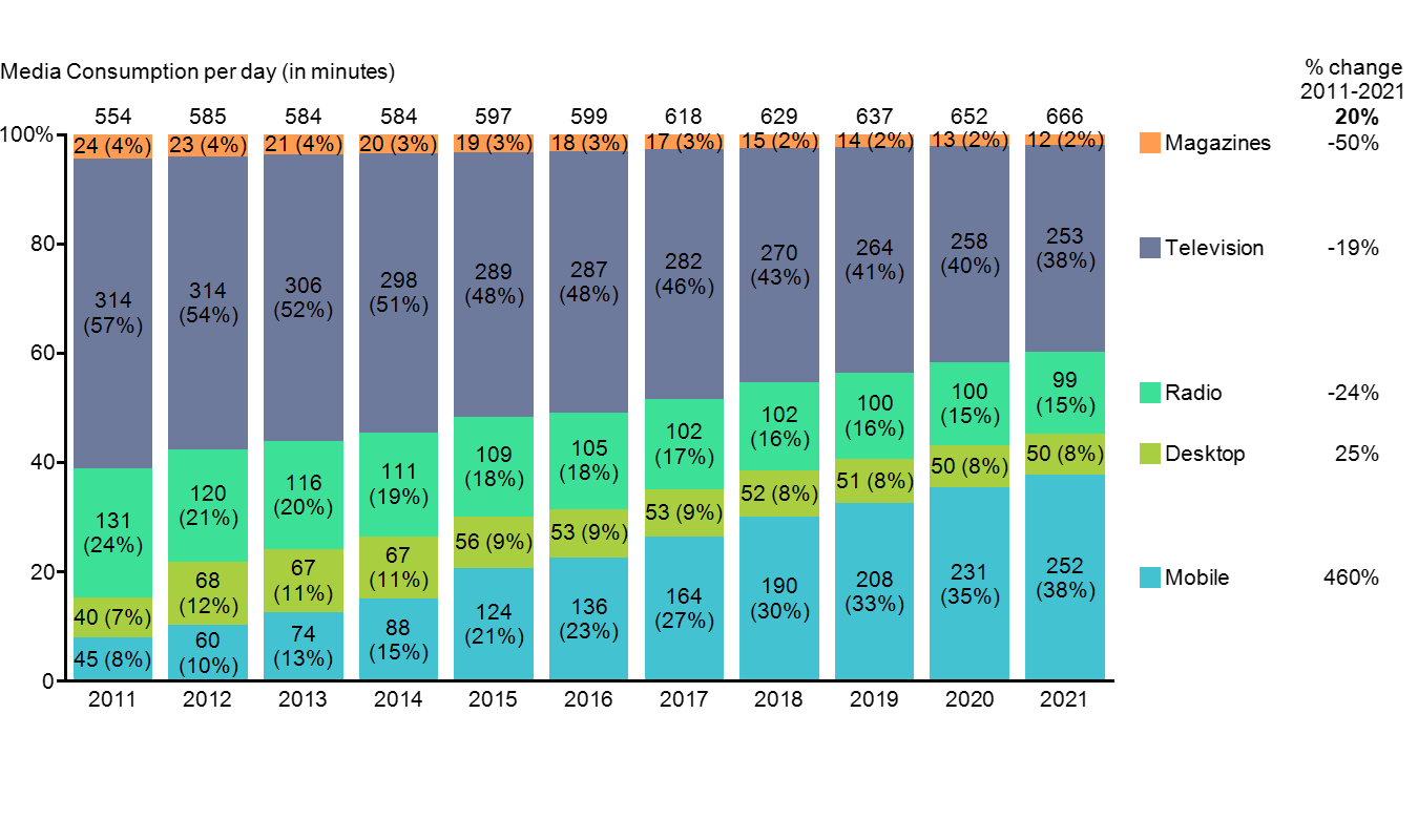
This is just an example. Each of the eleven bars above could be refashioned into a pie graph which would divvy up the media consumption statistics for a given year, but by laying them out as stacked bars, and organizing them chronologically, this graph shows how mobile consumption exploded over the course of those 11 years. It also shows the corresponding decline in more traditional media.
There’s an informational density to the stacked bar graph that I really like, and over the years, it’s become part of my mental toolkit. Imagine that chart with a stacked bar for each day of your life, plotted out across a week or even a month, with your day divided into the general categories that preoccupy you daily. You’d have a relatively steady 25-35% chunk devoted to sleep, perhaps another 10% devoted to self-maintenance (meals, exercise, grocery shopping), maybe 40-50% assigned to work, and then 10-15% reserved for leisure, entertainment, social life, et al. That adds up to roughly 100%, give or take, with the understanding that there’s going to be a certain amount of overlap—I don’t often know from one day to the next if my reading in a given day will be work-related or leisurely, and it’ll sometimes be some of each, for instance.

It’s been a month since I’ve posted here, which is a rare interruption for me both in terms of consistency and time. It’s not that I haven’t been writing at all, but I’ve been writing less, and for close to a month, hadn’t gotten to the point of posting an episode. And that got me thinking about the stacked bars that are my days, and how my percentages got thrown off. (That’s right, this entire episode thus far has been warming up to a defense of my recent Substacky silence. Sometimes, I just go down the meta rabbit hole.)
Spring semester is a challenging time for me to write, as the pie chart I created for the post celebrating my 100th episode revealed. A big part of that is a series of intensive responsibilities (faculty searches, promotion cases, departmental review and assessment, et al.) that come with being Department Chair. But this year has thrown its own set of obstacles my way. As you’ll recall, last fall I had a surgical procedure to remove one head from the healthcare hydra with whom I’ll be battling for the rest of my days. What I didn’t mention at the time was that my hernia repair surgery was prompted by a scan in the late summer that identified two issues, the second of which couldn’t be addressed until just a couple of weeks ago. In other words, I’m now at the tail end of recovery for a second surgery. Fortunately, this procedure didn’t require an external drainage tube, merely the repair of an internal one. (As with the fall, the solution was more traumatic than the problem, but better safe than sorry.)
So yeah, it’s been a convalescent couple of weeks for me, which has meant a spike in the self-maintenance segment of my days (and sleep, if I’m being honest). It’s also made it more difficult for me to focus in general, and to sit comfortably in order to type specifically. If that weren’t enough, January proved to be overwhelming in terms of the number of high-profile steps that our current regime took on its way towards authoritarianism—I’m not yet in a mood where I feel like rehearsing them here. We all know what they’ve done and continue to do3. It was (and is) deeply challenging for me to set aside time to write about literacy or to review books while largely unsupervised squads of masked gunmen are roaming the country kidnapping and murdering American citizens. Sometimes self-maintenance includes psychological restoration.
All of which is to say that I’ve spent the last month experiencing disruptions to the balance that allows me to write here and conduct the rest of my life within normal parameters. I’m slowly getting back on track, and I’m fairly certain that it won’t be a month before you hear from me again.
The more I thought about this line, the happier I became with it. For me, “having a shelf” means something like “I’ve read several to many books on the subject and would feel reasonably competent talking to an expert about it.” There’s also a certain amount of interest and amateur passion there on my part. I don’t want to distract myself too much here, but there are lots of topics for which I have a shelf.
Conducted at a societal scale, and turned into a requirement, datafication becomes something more akin to the “political tragedy of interactivity” (Galloway), which Fourcade and Healy talk about in The Ordinal Society. But that’s another episode…
Robin Sloan’s recent pop-up newsletter about the “flood fill” feels apropos. Although the piece itself is about AI and automation, I ended up reading and thinking about it in terms of fascism and democracy. It took a while, but this allegorical take has helped me climb out, a bit.
welcome back!
I was sorry to hear about your surgeries as I am facing major surgery on my back that will either allow me to walk unhindered again or settle the whole matter in an unsatisfactory way. Couldn't come at a worse time in my life when looking for employment has come to a standstill and my house has decided that now is the time to conspicupously fall apart when I have neither the physical capability to undertake the repairs or the cash reseves to hire out the job. TBH, I am entering a period in my life when the advancement of technology seems more of an obstacle than a benefit in many arenas of human endeavor. I have always valued working with nontraditional and under prepared students, which most universities seem uninterested in pursuing or developing outside of limited 'boxes' that are more of a hindrance than a help. Anyway, I was pleased to read another offering from you and hope your health is improving